
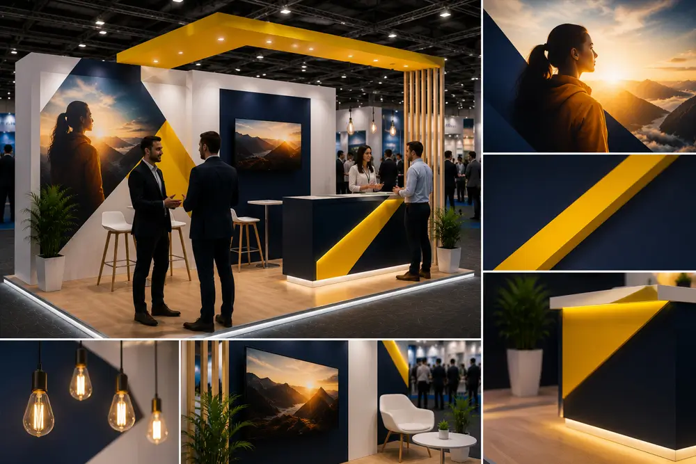
Exhibition stand branding is the discipline of communicating who you are and why it matters in the time it takes someone to walk past. Not the full story. Not the product features. Not the company history. Just enough to stop the right visitor and invite a conversation.
Most stands fail this test because they try to do too much. They display everything the company does, in the hope that something will resonate with someone. The result is visual noise that registers as background rather than signal.
What Visitors Actually Process in 3 Seconds
Research on visual attention in exhibition environments consistently shows that visitors process a small number of inputs in the time they spend looking at each stand from a distance. They register the dominant colour, the largest text, and a single strong visual image.
Everything else is processed only by visitors who slow down or stop. Your three-second brand communication must work with these three inputs: colour, headline, and image.
The Brand Hierarchy for Exhibition Stands
Think of your stand’s brand elements in a strict hierarchy. First: company name or logo, clearly visible at height. Second: your primary positioning statement in large, legible type. Third: a single strong supporting image or product visual. Fourth: secondary messages, case studies, product details and calls to action for visitors who have stopped.
Most stands invert this hierarchy or attempt to flatten it by giving equal visual weight to multiple messages. A visitor approaching your stand should have their eye drawn through this hierarchy from most important to least important in a clear, deliberate sequence.
Positioning Statement vs. Tagline
Your brand’s tagline may not be your best choice for an exhibition stand headline. Taglines are often abstract (“Powering a better tomorrow”) where a trade show requires specific relevance (“Custom exhibition stands delivered nationally”).
The most effective exhibition stand headlines answer the visitor’s implicit question: “What do you do and why is it relevant to me?” A clear, specific answer to this question converts more browsers into conversations than a brand tagline, even a well-crafted one.
Visual Identity Consistency
Your exhibition stand should be immediately recognisable as belonging to your brand by anyone who has encountered your website, social media, packaging or printed materials. Colour, typography, imagery style and tone of voice should be consistent across all channels.
Inconsistency between your digital presence and your exhibition stand creates cognitive dissonance. Visitors who have seen your website and find a stand that looks completely different experience a gap that undermines confidence in the brand.
Photography and Imagery Choices
The imagery on your stand communicates more about your brand positioning than almost any other element. Lifestyle photography showing your product or service in use communicates aspiration and application. Technical photography showing product detail communicates precision and quality. People-focused photography communicates approachability and human connection.
Choose imagery that is authentic to your brand rather than generic stock photography. Visitors notice the difference. Real customers, real products, real environments communicate credibility in ways that stock imagery cannot.
Staff as Brand Ambassadors
Your stand team is part of your brand presentation. Branded clothing that matches the stand aesthetic, professional demeanour, and consistent messaging all reinforce the brand story you are telling through the physical stand.
Brief your team on the brand positioning and key messages before every show. The three-second brand impression your stand creates is extended and reinforced by the first words your staff say to every visitor.
Frequently Asked Questions
How do I develop a strong exhibition stand headline?
Start with the question: “Why should the visitor I am targeting stop here?” Answer that question in twelve words or fewer. Test it with someone unfamiliar with your business. If they immediately understand what you do and why it is relevant, it works.
Should my exhibition stand use my brand’s exact pantone colours?
Yes, wherever possible. Colour consistency across print production, digital displays and physical materials is important for brand recognition. Provide your designer with exact CMYK and Pantone colour specifications. Check printed outputs against brand standards.
How much of my stand should feature the company logo?
Your logo should be prominently placed at height on the stand fascia or backwall, visible from a distance. Beyond this primary placement, restraint is generally preferable. Over-applying the logo across every surface reduces rather than increases brand authority.
Can my exhibition stand look premium if my brand is mid-market?
Yes. Premium stand appearance comes from clarity of design, quality of execution and coherence across all elements. Expensive materials are not required for a premium impression. A well-designed stand with quality graphics at a modest budget outperforms a confused design with expensive finishes.
How do I ensure my stand branding is consistent with my digital marketing?
Start from the same brand guidelines document. Provide your exhibition stand designer with the same assets used for your digital marketing: logo files, colour codes, approved typefaces, and imagery guidelines. Review the stand design against your website and social media before approving.
Does Brij & Co help with brand strategy for exhibition stands?
Our design team works with your existing brand guidelines and, where needed, advises on messaging hierarchy and visual strategy for the exhibition context. Talk to our design team
Brand Clarity Converts Browsers Into Conversations
Brij & Co designs exhibition stands that communicate brand stories clearly, distinctively and memorably. Contact our team to discuss your next exhibition project.